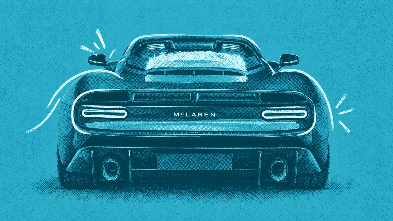
McLaren's old logo was one of the few you could recognize at 200 miles an hour. For the better part of three decades, that forward-leaning wordmark and its Speedmark swoosh have ridden on championship-winning cars, pit wall headsets, and bedroom-wall posters, and for most people who love this sport it has always looked the way speed feels.
So when McLaren pulled the cover off a new identity on September 22, I expected a tune-up, but what rolled out took an entirely different direction. The new all-caps wordmark is set in a custom typeface called McLaren Sans, with a small line tucked under the "C" borrowed from the sign that once hung above Bruce McLaren's family service station in Auckland. The Speedmark steps back into a supporting role, Papaya stays with the race team, and road cars pick up a new navy called Midnight.
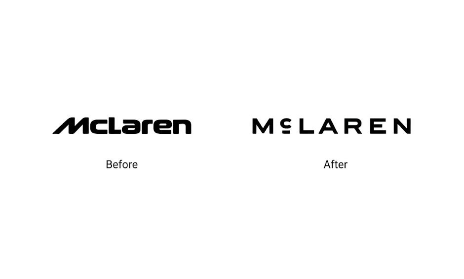
I want to be fair to what McLaren is trying to do, because I agree with the instinct behind it. The company just took a £500 million investment from its new owner, CYVN, and confirmed a performance SUV by 2030. It's about to meet customers it has never had before, and any brand in that position should be asking hard questions about whether its identity is built for where it's going. Staying relevant and directional is the job.
My problem is with how the answer showed up.
Legacy is a reason, not a strategy
The story behind the new wordmark is a good one. A family garage in New Zealand, a young driver building something out back, a sign over the door. It's the kind of origin most brands would love to have, and McLaren is right to want it closer to the center.
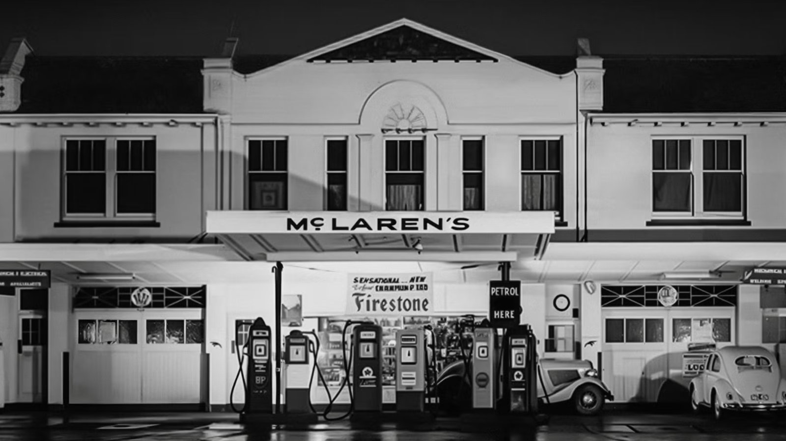
But a great story doesn't automatically make a great mark. Just because something is legacy doesn't make it right for today, and the design has to earn its place on its own before anyone hears the backstory. Without being told, almost no one is going to look at a small line under the C and think of an Auckland service station. When a mark needs the press release to mean anything, the heritage is doing all the talking and the design is along for the ride.
The irony is that McLaren already had legacy that works without explanation. The Speedmark, Papaya, and the sense of motion built into the old logo carry decades of racing in a way people recognize instantly. The new system keeps those assets but moves them to the back of the room, and puts a quieter, more generic one at the front.

It looks like an architecture firm
Here's a test we run with our own clients: take the mark out of context. Pull it off the car, away from the Papaya and the race footage, and put it on a blank page by itself. Then ask what kind of company it belongs to. Do that with the new McLaren wordmark and I don't see a hypercar maker. I see a design-led architecture practice, or a high-end developer with a beautifully restrained website and a portfolio of glass and concrete.
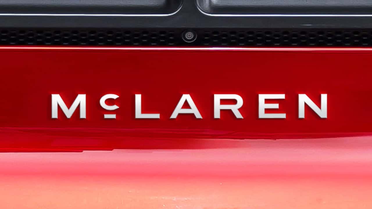
Plenty of people have looked at the same work and seen a luxury fashion house instead. Wherever you land, the conclusion is the same, because the mark reads as a category that isn't cars. Restraint is a legitimate luxury language, but McLaren's value has never been restraint. It has been speed, engineering obsession, and a willingness to go faster than anyone thinks is sensible.

In archetype terms, McLaren has always been a Hero brand. Bruce McLaren famously said that life is measured in achievement, not in years alone, and the company built its identity around that restlessness. The new wordmark reads like a Ruler: composed, controlled, and quietly expensive. There's nothing wrong with the Ruler, it just isn't who McLaren is.
Pointing to the SUV buyer doesn't solve this either. Someone shopping for an alternative to a Lamborghini Urus still wants to feel the performance DNA, since that's the whole reason they'd choose McLaren over a Range Rover. Strip the energy out of the brand and you don't win the new customer; you give them one less reason to pick you. The problem isn't which customer this identity is aimed at. It looks off target for all of them.
McLaren isn't the first
If this feels familiar, it should. Two of the most storied names in the business have made their own versions of this mistake in the last two years.
In late 2024, Jaguar stopped selling new cars in its home market while it retooled for an electric future, then reintroduced itself with a mixed-case wordmark, a campaign built around the line "Copy Nothing," and a launch film that didn't show a single car. Jaguar had a real problem to solve, an aging lineup and a shrinking customer base, and it deserves credit for being bold. But the answer it chose made the brand unrecognizable to the people who still loved it, without giving anyone new a clear reason to care. The backlash was loud enough that Jaguar shelved much of its planned follow-up marketing, and the creative chief who led the work has since left the company.
Ferrari followed this spring with the Luce, its first electric car. It brought in LoveFrom, the design collective founded by Jony Ive and Marc Newson, and the result is a five-seat, €550,000 liftback that looks more like a beautifully made piece of consumer technology than a Ferrari. Ferrari's shares fell more than 8% the day after the reveal, and its own marketing director admitted the negative reaction was bigger than the company expected. Ferrari has one of the most disciplined design languages in the world. Handing it to people whose genius was built in a different category, then asking its most loyal customers to follow, is how a brand loses touch with both its design system and the people who keep it in business.
Three legendary brands, three different problems, and the same result. Each one reached for a new customer and came back with work that looks like it belongs to someone else.
A solution looking for a problem
Customers almost never ask for a rebrand, and they shouldn't have to. The good ones answer a problem the business can see and the market can feel: the logo doesn't scale, the company has outgrown its name, or people no longer understand what you do. McLaren had none of those. The old mark was recognizable, loved, and doing its job.
When a brand changes something that's working, the burden of proof goes up. The new work has to be so clearly better that people forget they ever liked the old one. This work is competent, tasteful, and well crafted, but it isn't clearly better. It's different, and different in a direction that pulls McLaren toward everyone else.
That's the quiet risk of the minimalism wave working its way through automotive. Every individual decision looks sensible on its own: cleaner type, fewer flourishes, a more flexible system. Add them up across an industry and you get a row of elegant wordmarks that could belong to anyone.
What you should do differently
If you're weighing a rebrand of your own, the lesson here isn't to stand still. Growing companies outgrow their identities, and new customers deserve a brand that speaks to them. The lesson is to change with intention, and to make sure every decision traces back to who you already are. Here's how we walk our clients through it.
Start with the problem, not the look. Before anyone opens a design file, we sit down together and name exactly what the current brand isn't doing. Maybe it can't stretch across a growing portfolio. Maybe your best customers no longer see themselves in it, or it simply looks like a smaller company than the one you've built. If we can't put the problem into a single sentence, we're not ready to change anything.
Take inventory of what you already own. Every established brand has equity hiding in plain sight: a color, a shape, a phrase, a story your customers repeat for you. We map those assets with you and decide which ones carry the most weight, because those are the ones a rebrand should protect and push forward, not move to the back of the room.
Define who you are before deciding how you look. This is where archetype work earns its keep. Together we identify the character your brand already plays in your customers' minds, then hold every creative decision up against it. A Hero brand should never end up looking like a Ruler just because a new direction felt more sophisticated in a presentation.
Design for the customer you want without losing the one you have. New audiences matter, and we'll research them with you. But the people who already love your brand are your most powerful marketing channel, and they should recognize you on day one. We test new work with both groups before anything goes live.
Run the context test. Take the new identity off your product, out of your photography, and away from everything that props it up. Put it on a blank page and ask what kind of company it belongs to. If the answer isn't yours, the work isn't done. It's a simple check, and it would have flagged all three of the brands in this article.
Launch it as a story, not a surprise. The brands that get this right bring their audience along. They explain what changed, why it changed, and what stayed the same. We build that narrative alongside the identity, so the launch feels like your next chapter instead of a stranger showing up with your name on it.
Rebrands should make a company more itself. The best ones feel inevitable, as if the brand finally caught up with who it always was. McLaren's new identity feels like it caught up with somebody else.
Evolve for the customer you want, absolutely. Just make sure that when they see you, they still know exactly what you are. If you're feeling the pull toward a rebrand, we'd love to walk through it with you, starting well before the first sketch.
